
Pentagram Marks: 400 Symbols and Logos was launched this week and in his Noisy Decent Graphics blog, Ben Terrett mentions their innovative 'xylophone'-style solution to displaying the pages. Obviously with portfolios the items on show would be our books, but it's further proof that uniform works (ie. Pentagram's book pages, our portfolio folders) look rather impressive laid out like this on a long table.


A couple of the set-ups from this year and last year's AIGA 50 Books 50 Covers show... Maybe a little bit gimmicky in terms of theme but they've had to put a lot of thought into how to make all the books accessible and making people comfortable stopping and reading them.
2007 AIGA Dinner Party
Images from..
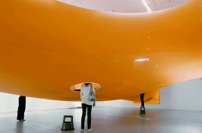
Berlin’s Magma Architecture at the Berlinische Galerie “head-in | im kopf”,
Danish pavilion at the World Expo 2008 i n Zaragoza, Spain,
Beijing Olympics - Samsung.


Chelsea space up until last week was using foamex mounted layout boards with a matt seal for 'Steve Thomas: Big Biba and other stories 17.09.08 – 18.10.08' . The boards were standing proud off the wall slightly with museum cases made with acrylic and mdf and track-mounted spots. Its just fun to see a show how Steve went back to the traditions of graphics display based on classic print and layout. Over a large show the print costs would rise rapidly but its still a simple way to show image and objects. I wonder if there was a layout wall like this say 15 metres wide with 3 projections side by side providing the images in a similar format and users could flick through work on the wall if this would be cheaper and more cost effective rather than printing 40 or 50 metres of flat mounted work at a huge expense. Also here's a similar effect from our show last year and another example from David Lachapelle at the barbican (more).


